Today we’d like to share some button styles and effects with you. We make it as light as posible, with pure css and html. This button style comes from Upwork Jobs. We tried to create the button exacly the same with colors, interaction and shapes.
The transparent button with a slightly rounded border seems to be quite popular on sites with image backgrounds. But there is no limit to roundedness, everything goes these days, which is great for creating fitting buttons for any design. What they all have in common is simplicity and effect subtleness.
The button interaction is quite complicated, we need to give the button a wrapeer to hold the animation and mantain its concistency
Some of the styles are a bit miss styled with this website — they might fit into some special designs.
HTML
<button className="button-cta">
  <span>Get In Touch</span>
</button>
Style
.button-cta {
  overflow: hidden;
  background: black;
  color: white;
  font-size: 24px;
  border-radius: 50px;
  position: relative;
  border: none;
  transition: all 0.3s ease;
  padding: 15px 40px;
}
.button-cta:hover {
  padding: 18px 48px;
}
Thats for base button style
Ripple Hover Effect
Let’s start!
The first one is ripple overlay on hover effect
Result
HTML
<button className="button-cta button--ripple">...</button>For style we use backdrop filter with contrast 0.7 to make the overlay lighter
Style
.button-cta.button--ripple:before {
  content: "";
  position: absolute;
  top: 0;
  bottom: 0;
  right: 0;
  left: 0;
  transition: all 0.8s;
  display: block;
  margin: auto;
  width: 0;
  height: 0;
  border-radius: 100px;
  animation: ripple-animation 0.5s;
  backdrop-filter: contrast(0.7);
}
.button-cta.button--ripple:hover:before {
  width: 100%;
  height: 100%;
  animation: ripple-animation-reverse 0.5s;
}
Animation
@keyframes ripple-animation {
  0% {
    width: 100%;
    height: 100%;
  }
  12% {
    width: 89%;
    height: 89%;
  }
  24% {
    width: 56%;
    height: 56%;
  }
  36% {
    width: 2%;
    height: 25;
  }
  54% {
    width: 25px;
    height: 25px;
  }
  74% {
    width: 5px;
    height: 5px;
  }
  82% {
    width: 10px;
    height: 10px;
  }
  92% {
    width: 2px;
    height: 2px;
  }
  96% {
    width: 5px;
    height: 5px;
  }
  100% {
    width: 0;
    height: 0;
  }
}
@keyframes ripple-animation-reverse {
  0% {
    width: 0;
    height: 0;
  }
  25% {
    width: 25px;
    height: 25px;
  }
  100% {
    width: 100%;
    width: 100%;
  }
}
Button Outline Hover Ripple Effect
Next one we buikt the outline version of the button
Result
HTML
<button className="button-cta button--ripple-outline">...</button>Style
.button-cta.button--ripple-outline {
  border: 2px solid black;
  background: transparent;
  color: black;
}
.button-cta.button--ripple-outline:hover {
  color: white;
}
.button-cta.button--ripple-outline:before {
  content: "";
  position: absolute;
  top: 0;
  bottom: 0;
  right: 0;
  left: 0;
  transition: all 0.8s;
  background: black;
  display: block;
  margin: auto;
  width: 0;
  height: 0;
  border-radius: 100px;
  animation: ripple-animation 0.5s;
  z-index: -1;
}
.button-cta.button--ripple-outline:hover:before {
  width: 100%;
  height: 100%;
  animation: ripple-animation-reverse 0.5s;
}
We still reuse the animation from ripple effect of block button
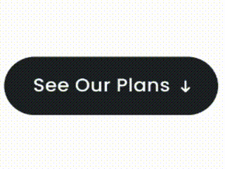
Arrow Around Effect
Last one we play with the arrow animation.
We not use icon in this article, but the conseft was exacly the same, we just need to adjust the psuedo hover to the icon
Result
HTML
<button className="button-cta button--arrow">...</button>.button-cta.button--arrow {
padding: 15px 50px 15px 40px;
}
.button-cta.button--arrow:after {
content: "↓";
position: absolute;
margin-left: 10px;
transition: all 0.3s ease;
}
.button-cta:hover.button--arrow {
padding: 18px 60px 18px 48px;
}
.button-cta:hover.button--arrow:after {
animation: arrow-animation 0.3s ease;
}
@keyframes arrow-animation {
0% {
bottom: 25%;
}
50% {
bottom: -25%;
}
51% {
bottom: 100%;
}
100% {
bottom: 25%;
}
}Thats all for today, we hope you enjoy the article.
Thank you